The Most Common Design Mistakes We See (and How to Fix Them)
After years of walking into homes across Northwest Arkansas, we've noticed a few recurring missteps. The good news? Every one of them is fixable.
M Grace at Home
Interior Design Studio

We say this with love: almost every home we walk into has at least one design mistake hiding in plain sight.
Not because the homeowner has bad taste — usually, the opposite is true. The issue is almost always about proportion, placement, or a choice that made sense in the store but doesn't quite land in the room.
Here are the ones we see most often, and how to set them right.
1. The Rug Is Too Small
This is far and away the most common mistake. A rug that's too small for the space makes furniture float awkwardly and the room feel disjointed.
The fix: Your rug should be large enough that the front legs of your major furniture pieces sit on it. In a living room, that typically means an 8x10 or 9x12. When in doubt, go bigger.
2. Furniture Pushed Against the Walls
It feels counterintuitive, especially in smaller rooms, but pulling furniture away from the walls actually makes a space feel larger and more intentional.
The fix: Float your sofa a few inches (or a few feet) from the wall. Create a conversation zone in the center of the room. The space behind the furniture isn't wasted — it creates depth.
3. One Overhead Light and Nothing Else
A single ceiling fixture creates flat, shadowless light that makes even a beautiful room feel sterile.
The fix: Layer your lighting. Add table lamps, floor lamps, sconces, or under-cabinet lighting. The goal is pools of warm light at different heights, not one source blasting from above.
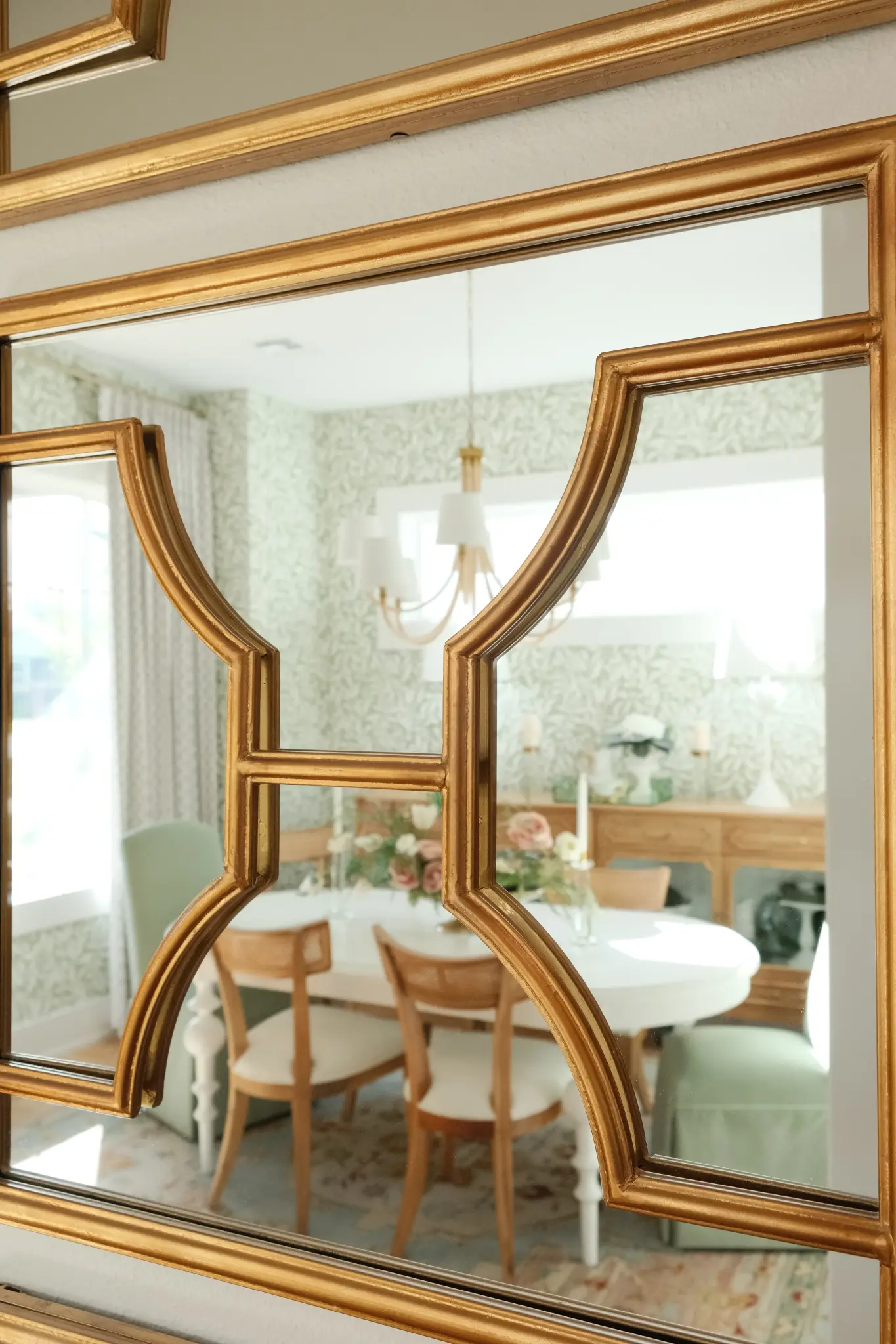
4. Hanging Art Too High
The center of your artwork should sit roughly at eye level — about 57 to 60 inches from the floor. Most people hang art too high, which disconnects it from the furniture below and makes the room feel top-heavy.
The fix: Measure from the floor to the center of the piece. If it's above a sofa, leave 6–8 inches between the top of the sofa and the bottom of the frame.
5. Matching Everything
A room where every piece matches — same wood tone, same metal finish, same era — can feel flat and showroom-like rather than personal and collected.
The fix: Mix your metals. Combine wood tones. Pair something vintage with something modern. The tension between styles is what makes a room feel alive and uniquely yours.
6. Ignoring the Ceiling
The ceiling is the fifth wall, and it's almost always ignored. Flat white ceilings are fine, but a room truly transforms when you treat the overhead plane with the same care as the rest.
The fix: Consider painting your ceiling a shade warmer than stark white. Add a statement light fixture. If you have crown molding, make sure it's properly scaled to the room height.
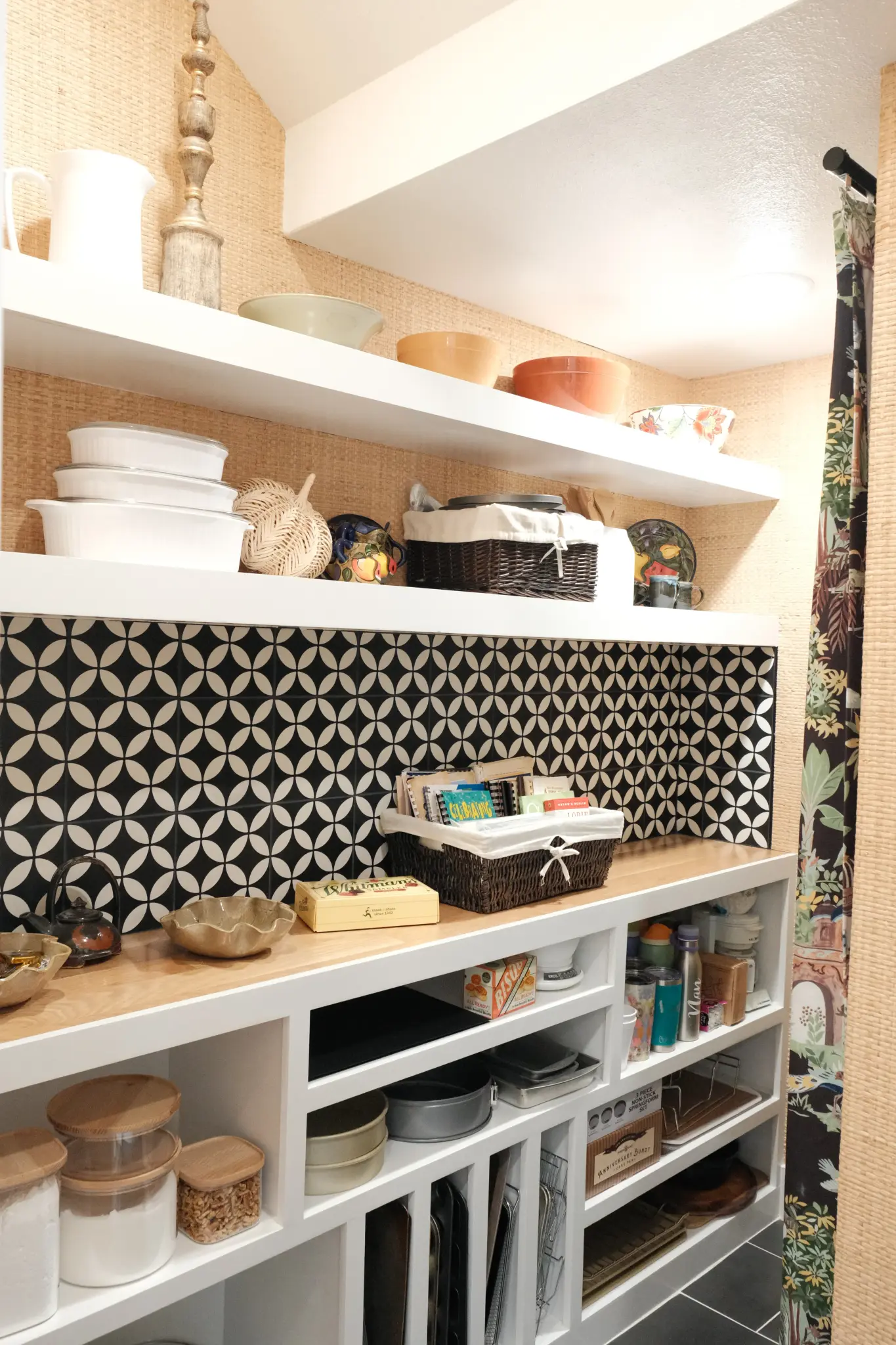
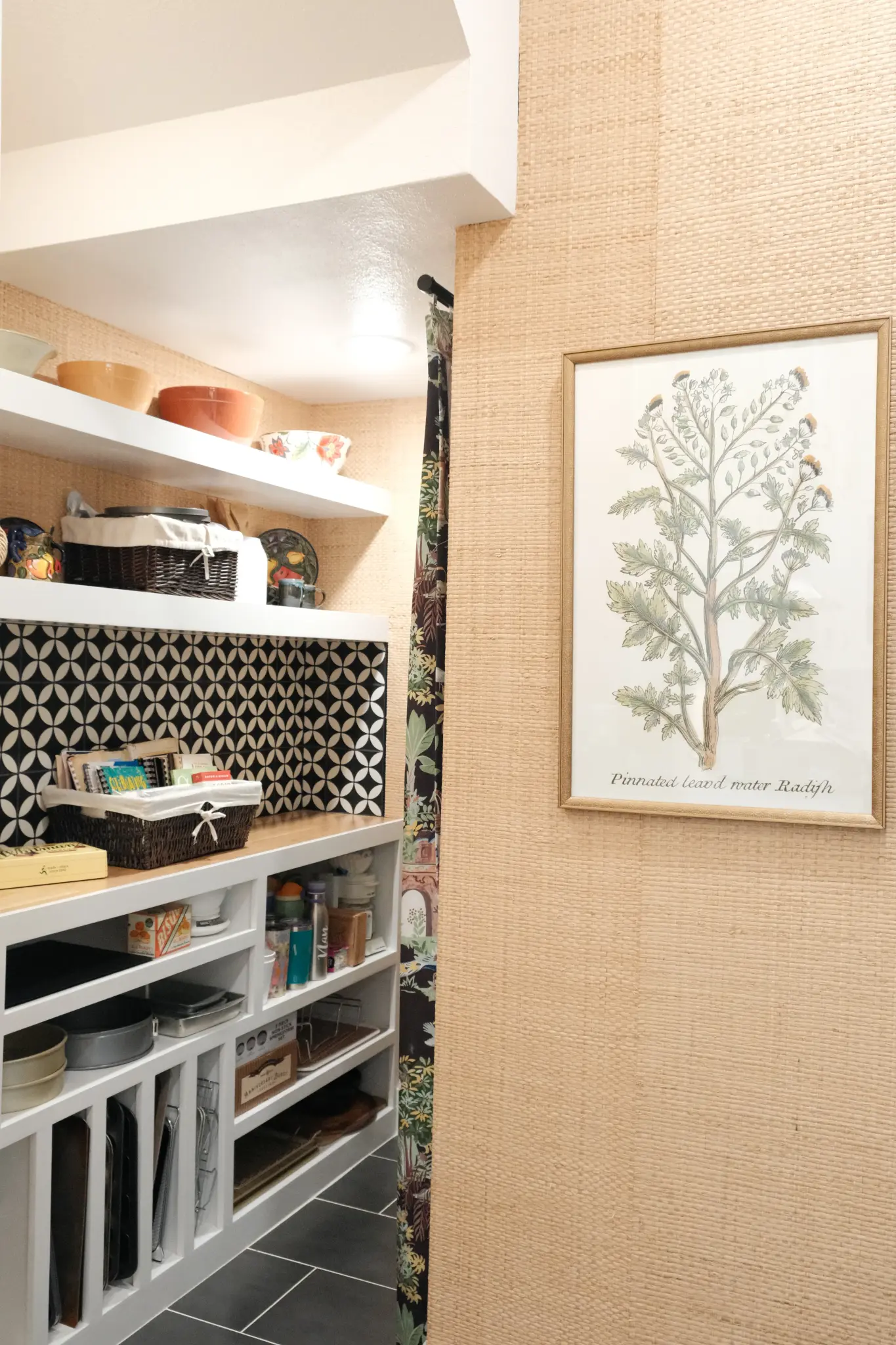
7. Over-Decorating
More is not more. When every surface has something on it and every wall is covered, the eye has nowhere to rest. The result is visual noise, not warmth.
The fix: Edit ruthlessly. If a piece doesn't make you feel something or serve a purpose, it's clutter. Leave breathing room on shelves, countertops, and walls.
The Common Thread
Every one of these mistakes comes down to the same thing: proportion, balance, and intention. Design isn't about having the most expensive things — it's about making the things you have work together in harmony.
Spotted a few of these in your own home? Let's talk. We can help you fix what's not working and build on what is.
You might also enjoy


Schedule a Consultation
Ready to transform your space? Share a few details and we'll be in touch. Include an email or phone so we can reply.